Thursday, December 15, 2011

going logo go

 i came up with logos for future companies i might own :)

i want to own a strip club called Bottoms up. every simple and classy look to it. the yellow gives it a mellow feel

i like japanese stuff especially there clothing trends. one of my favorite styles is called gothic lolita. which is really elegant and cutesy, fluffy girly look. sort of like alice in wonder land. i created my logo to look like a blimp so that it gets the feeling that my gothic lolita clothes will take you away
i want to own another clothing store but its the opposite from the whole cute scene.  ha ha hyaena is going to be a hardcore store with tons of graphic tees sort of like yellow rat bastards


finally, i want to own a cafe! with little cute cup cakes, biscuits, cookies, and all sorts of sweets and beverages !


Thursday, October 27, 2011

samsam sweets


i was kind of bored, so i started organizing some of my research materials and i found my little guy!!! 
i decide he's too wild to be alone and i gave him a mistress(ms. iceice baby), in a cake lollipop world. 
this is totally paradise for me :D
i was inspire by the wade brothers, their photography is quite something. i bumped into them while stumbling on stumbleupon.

i can't remember where i found these guys (besides google). the girl i grabbed her from this really extraordinary  guy that creates super cool mask, Tom Banwell!!!

picture perfect


my "picture perfect" design is the warm up for my second paradise picture. my objective is to grab random picture and but them together. i have to make sure they harmonize.

i grabbed random images off google, put them into a folder then choose which pict was best

(my picture looks really dark mainly because i was listening to nine inch nails - perfect drug)


these are my toys that ive experimented with:

(i love little British boys with their shirt shorts )

a french pitbull skull (i have a skull fetish)

 clouds (love)

grass.... great for cows


first, i duplicated the grass background then added that lovely cloud background.


  i duplicated the grass a again but this time i cut parts of it to make it look like a hill

i blurred the tippy tops of my hills to make it look a little realistic


i figured ill use the rule of thirds on this pic


i used the burn tool to create a shadow for the skull and the clone tool to add some highlighted grass


i added my cute little tiny shorts boy after darkening and highlighting part


and by tweaking the saturation and the color balance i created my perfect little eerie world


ta daaaaa :)


coloring pages


for class we had a brief lesson on coloring characters. it sort of reminded me of coloring in a coloring book lol.


since were using stumbleupon to grab inspirational things, i found this interesting illustration from some random site.


i worked on each part on their own layer. first i painted her skin brown. with a 41% opacity


next i worked on the  earrings

on a new layer i worked on the lips. i put this one on overlay.


the last peace was the head dress,


ta da :)


i played with it with my own art work as well.


 this is my other side and me. i use to have blue hair back in the days lol

retouch 2!!!!


this is my second time using retouch.  i had to use the healing tool this time. i found a random picture of a 50 year old woman and i made her look 30 oh snaps.


see she doesnt looks so bad but there is always room for improvement


since she is older, she has a fair amount of wrinkles on her cheeks, eyes, chin, and lips


i used the heal tool to grab parts of her skin to cover the "imperfections".
i also used the smug tool to get those wrinkles from her lips


for the finishing touches i tweaked the picture by adjusting the curve. i gave it a nice warm tone. she looks like shes ready to party :)

Friday, October 21, 2011

retouch but not too much!!!


Ok so i missed the last class assignment but i understand what i must do. i have to retouch or improve a photo. i decided to grab a picture of someone without make up. Taylor Swift isn't my favorite singer but her face would do well. most people who have freckles don't really like them, so used my magic mouse and fixed that.


This is the original photo. the photographer really emphasized on how plain her face looks by making the picture very bright, therefore making her skin super pale.
i didn't like the pale look, so i changed the levels of light by going on adjustments- curved. 


next i reduced those freckles and minimized the grainy texture on her face by going under filter - blur- blur surface.


 i selected the amount that i wanted the tool to blur. once that was done. it made the photo look unrealistic. so i created a mask and removed the blur just a bit so that realist features, like shadow, tones and a little bit of grainy texture can show up. its important to make keep some grainy  textures so that the photo doesn't lose its realness 


and wa laaaaaa :)

Thursday, October 13, 2011

perfect little paradise


Im a topsy turny type of person, so to me paradise looks like a cute yet creepy nightmare. i put alot of thought into this project. i made the teddy bear faces from this whimsical band called aphex twins


the first thing i did was some research. once i found all the images that i wanted to use, i used the quick select tool to separate the image from the background then put it in a new mask.


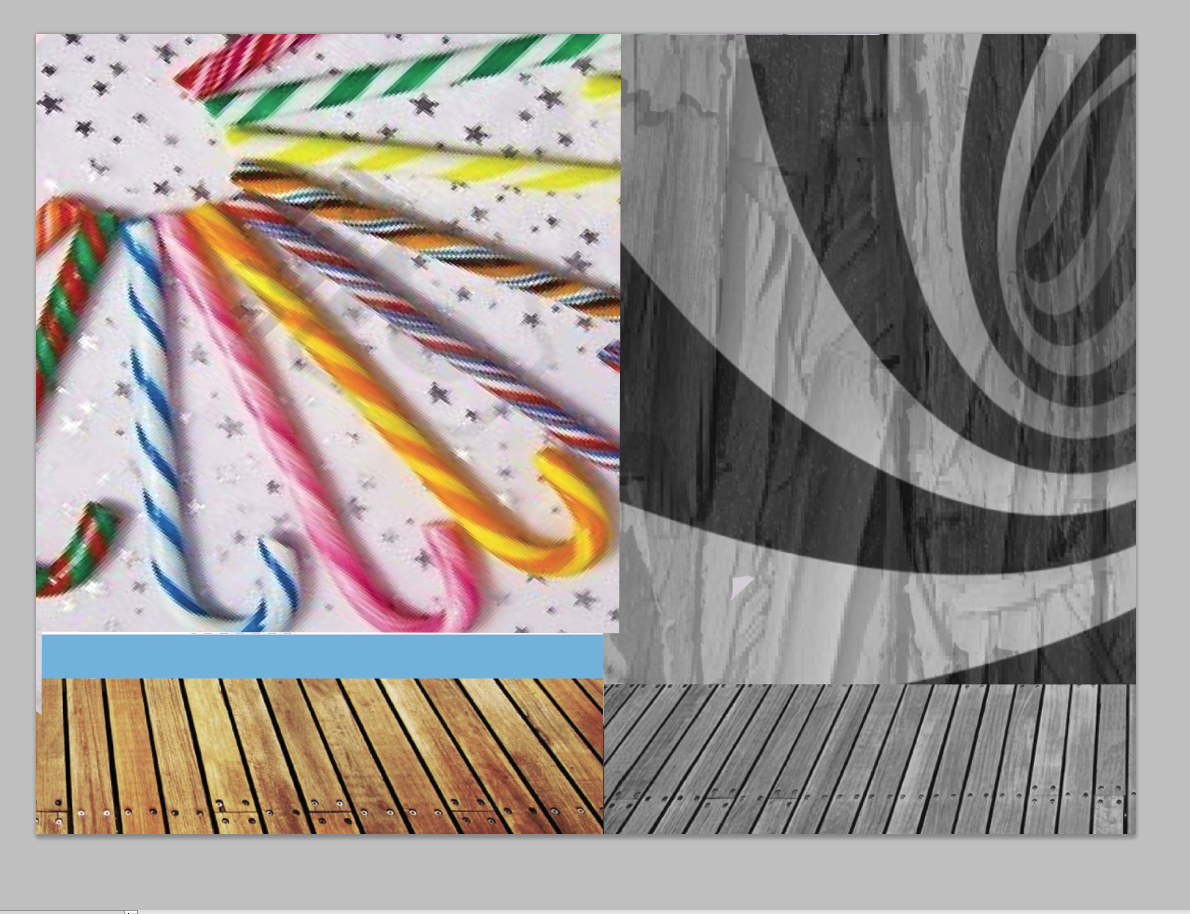
 next i used illustrator to create the cute room. after i put it in photoshop and added a wooded floor so that i can look roomish.


 i used a black and white swirl background with the as wooden floor to create my creepy room. then connected both rooms. i added a textures to the background of the creepy room


 i added colorful candy canes to the cute room


 then lowered the opacity so it can serve as a texture.


i added a rainbow lollipop to top the background off.


 i started to add the things that would make my paradise a perfect place for me


i added an eye and hands into the frame to make it look more interesting.


 and faces on the bears to make them look creepy cute and different from the other bears


 i put a little drop shadow so that the picture can look a little 3dish


for this doll, since its on the creepy side i made her eyes white


i made my creepy room just alittle dark


last i saturated the whole picture to so that everything can pop
wait i forgot i added my own little touch. i added a little me to my paradise by drawing her out in illustrator


 and wa la done :)


oh here are all the links to the images that i used. (i couldnt find the link for the big orange kitty >.<)


hands
 creepy eye
aphex twins
wood floor pattern
texture
doll dancer
sleeping doll
multiple candy canes
frame
doll in chair
black and white swirl
 two bear
peeling paint
colorful lollipop
queen chair
missing the cat